Fashion and jewelry work usually looks effortless when it succeeds, which is exactly why the direction behind it gets underrated. The useful question is not whether the images look polished. The useful question is whether the frame, styling, lighting, and product emphasis all support the same idea without fighting each other.
The paired proof route keeps the commercial image record visible. This page explains the decision layer behind that kind of work and why visual direction matters more than isolated “pretty” frames.
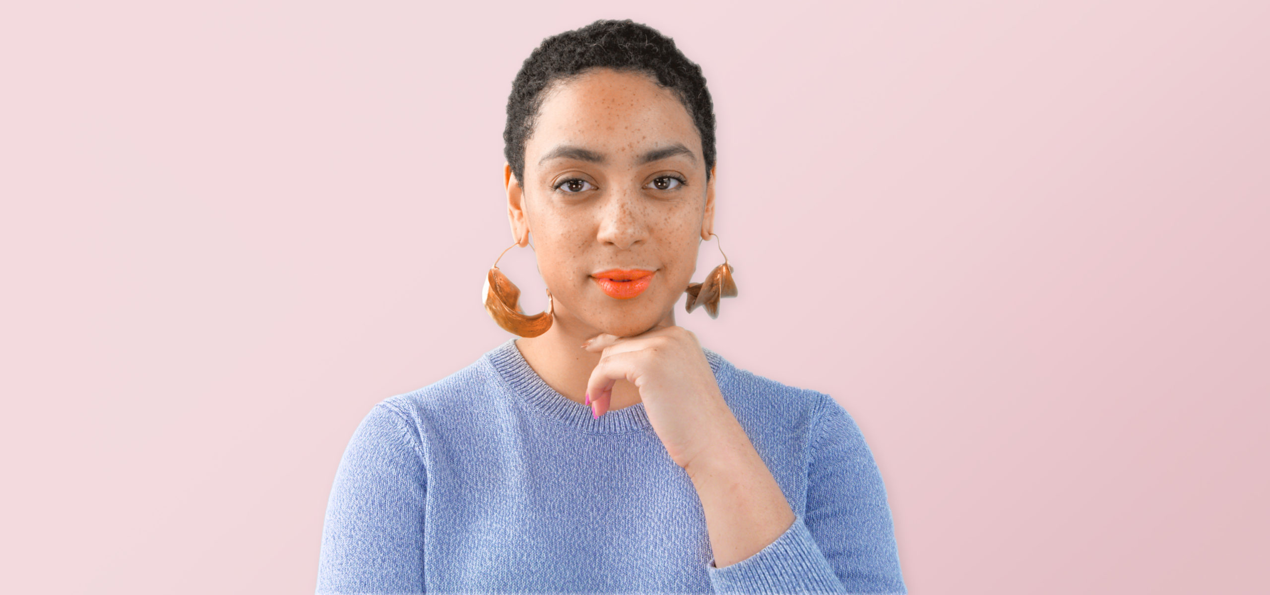
Product-adjacent imagery still needs a point of view
Jewelry and fashion-facing image work sits in an awkward middle zone. It needs the discipline of product photography, the atmosphere of editorial work, and enough human context to keep the image from feeling sterile. That balance does not happen automatically. It is the result of clear aesthetic decisions made early enough to control the frame.
Why styling and lighting carry the message
In this category, styling is not surface decoration. It is part of how the brand signal is built. Lighting does the same job. Together they decide whether the work reads aspirational, clean, luxurious, intimate, dramatic, or forgettable. Once those signals drift apart, the image can still be technically fine while losing commercial clarity.
What this route adds
The proof entry keeps the image evidence intact. This page explains why the direction behind the images matters and why that work belongs in the broader commercial-production conversation.